Branding
ODYSSEY BRAND
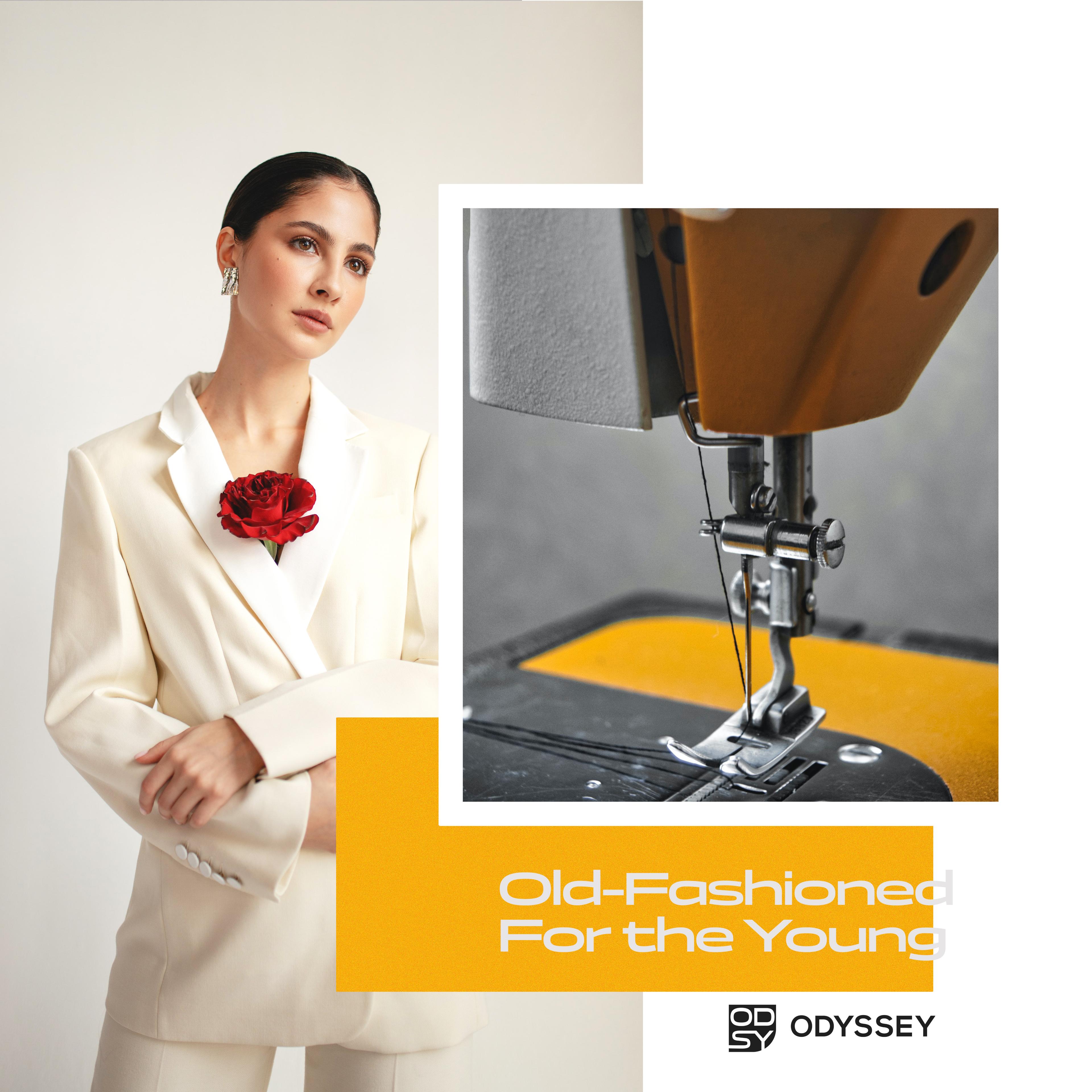
Brand identity for a fashion label built on a single tension: old-fashioned craft sensibility, sold to a young, independent audience.
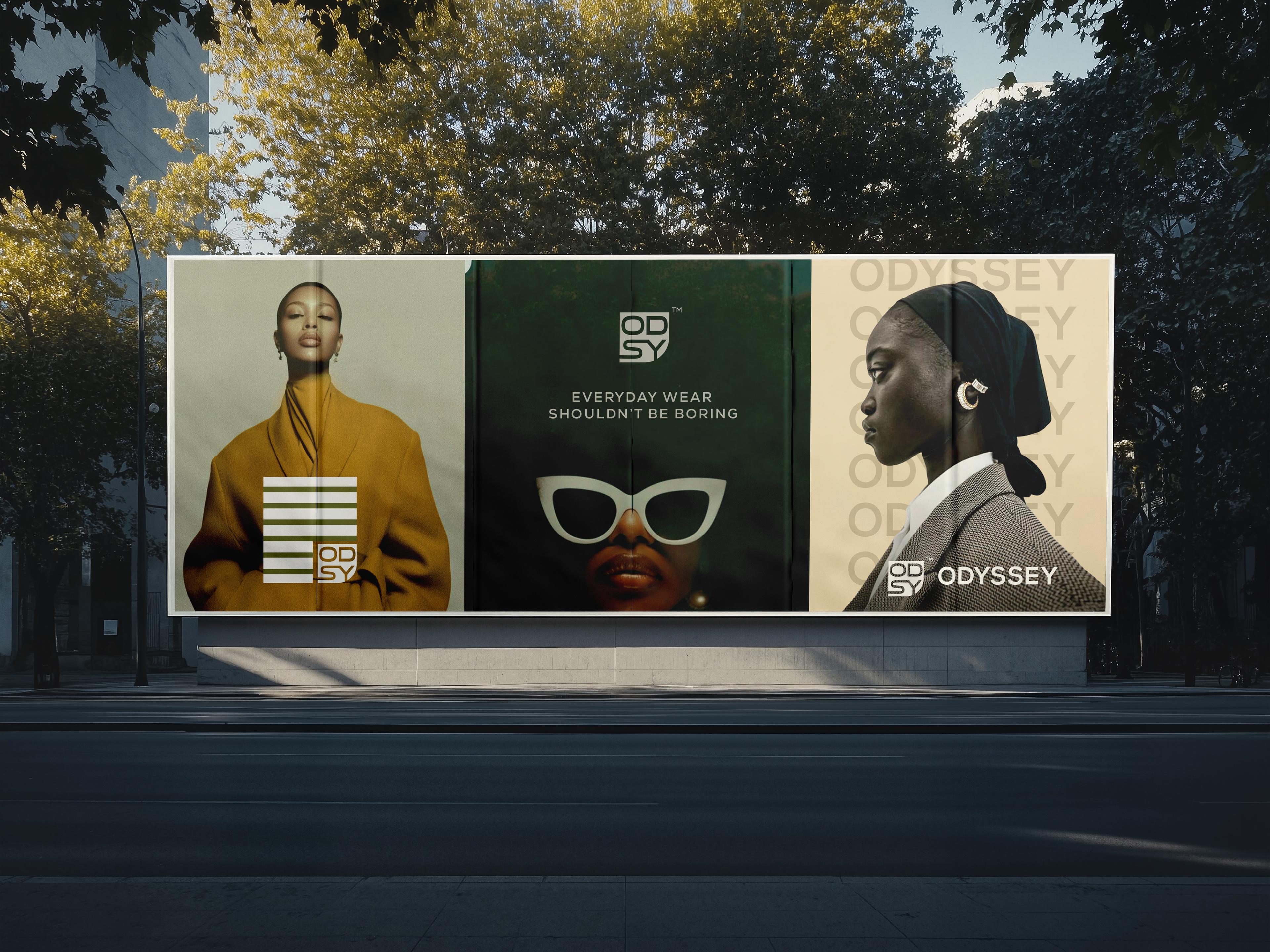
Odyssey needed an identity built around a real tension in its own brief: a customer who's young, often living alone for the first time, but drawn to old-fashioned craft and quality over anything trend-chasing. The brief called for a mark that could hold both sides of that without turning into a costume — current enough to read as theirs, considered enough to feel made to last.
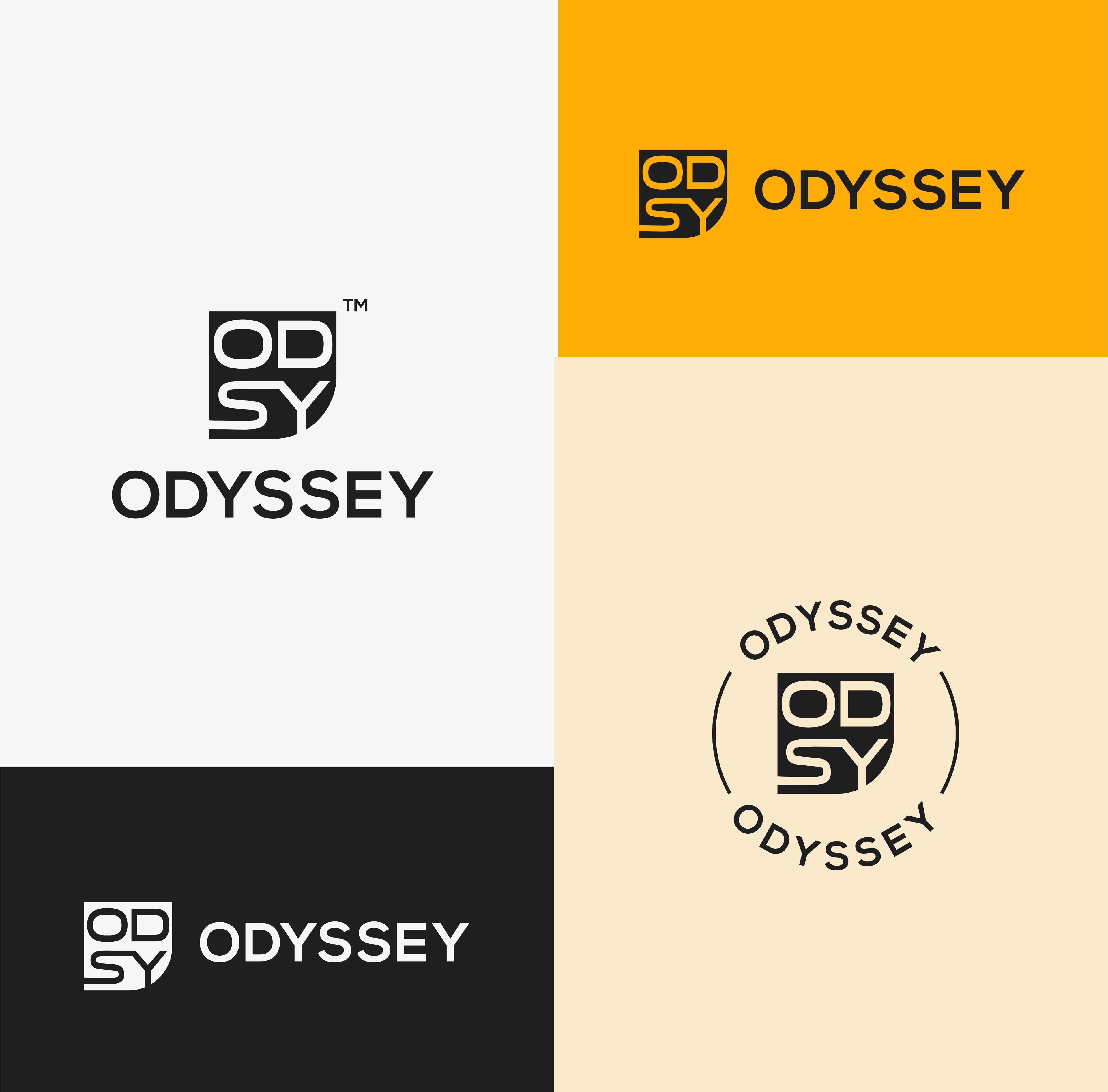
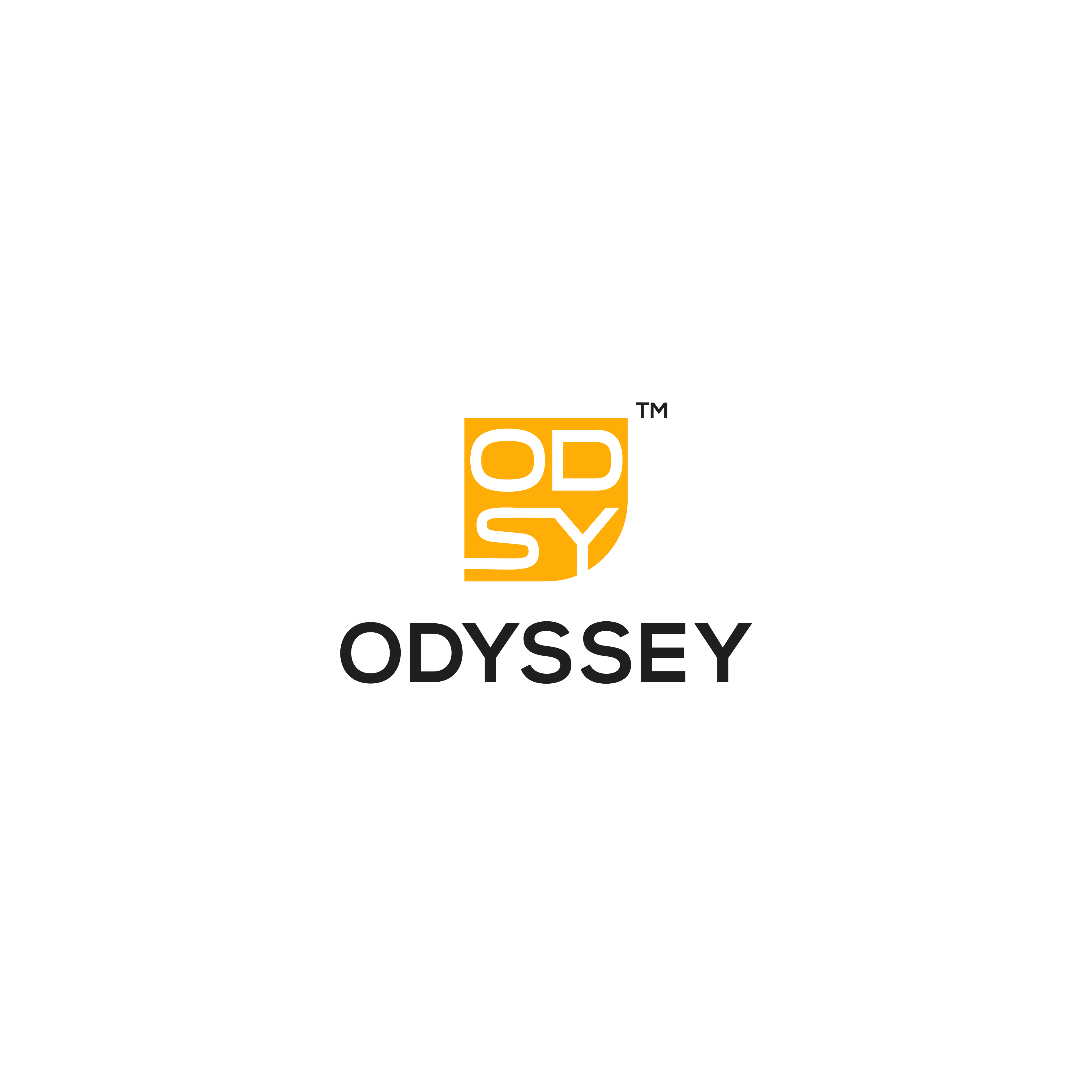
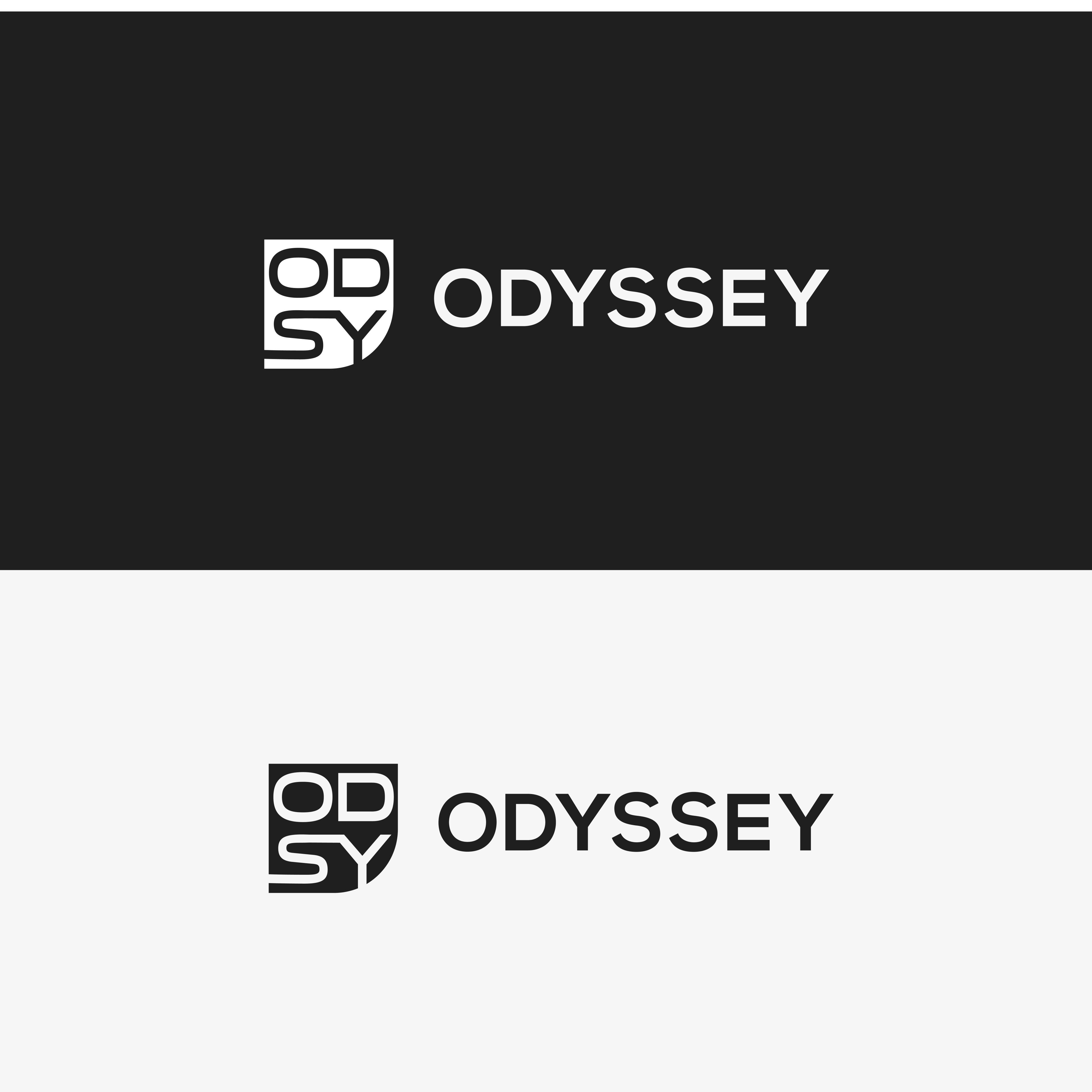
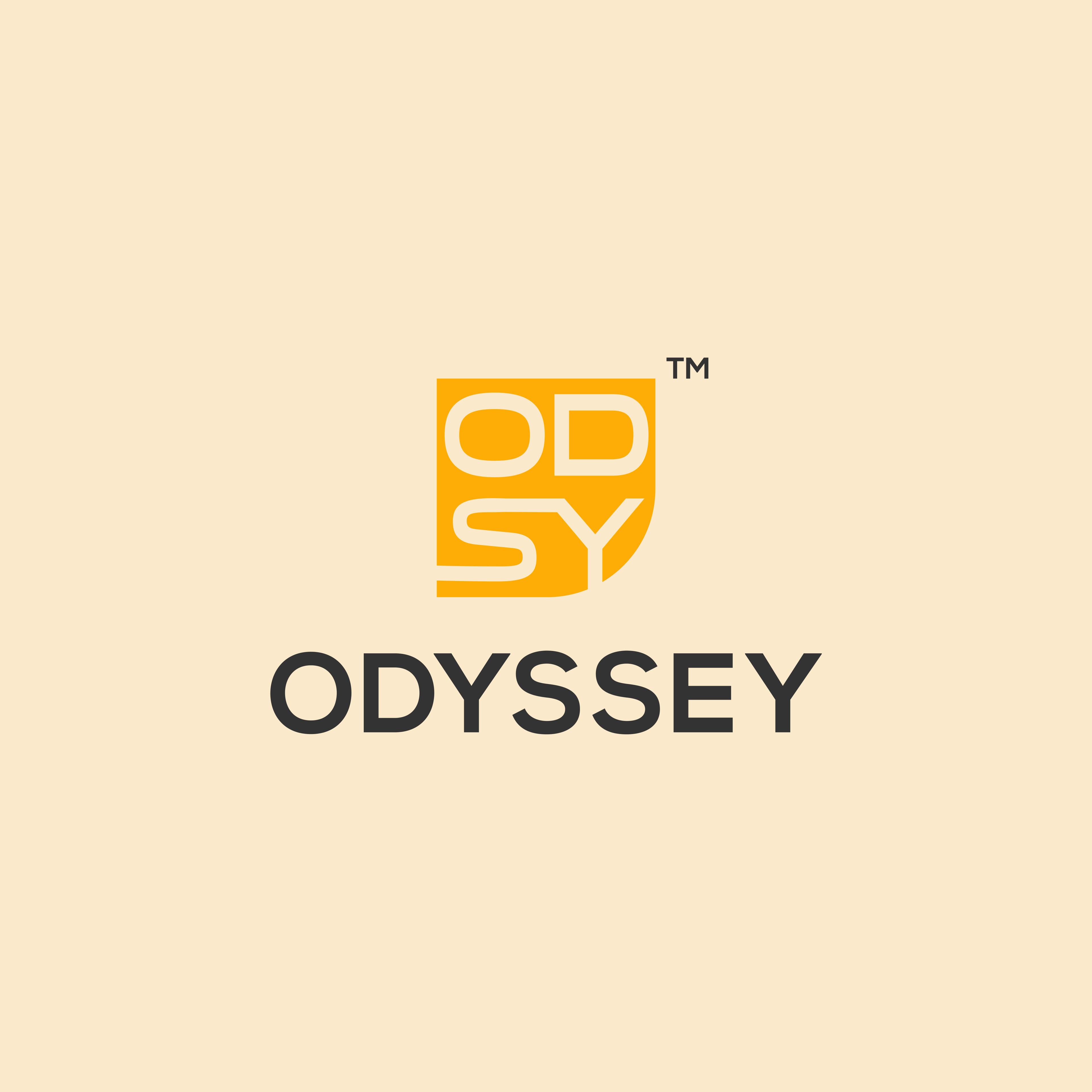
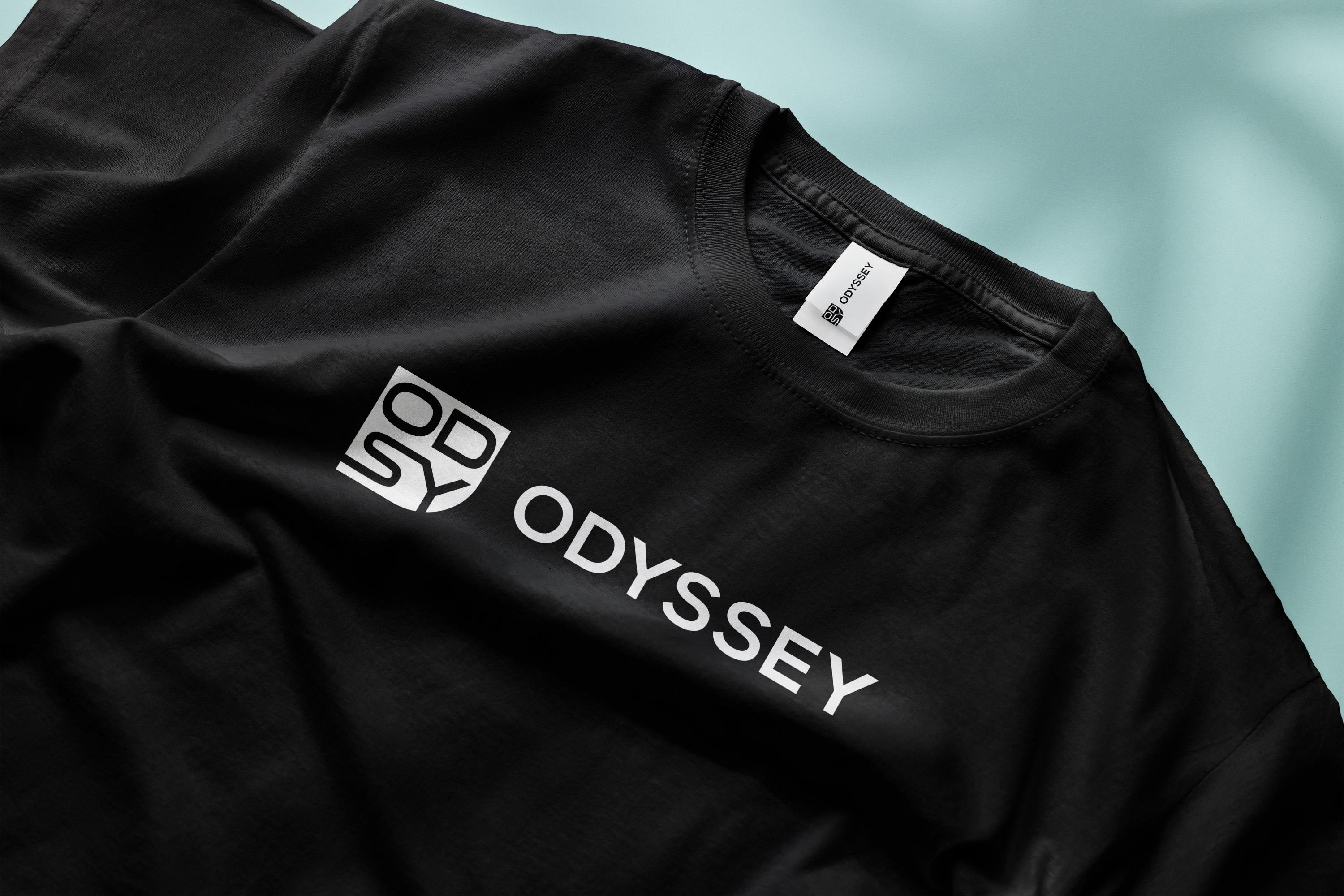
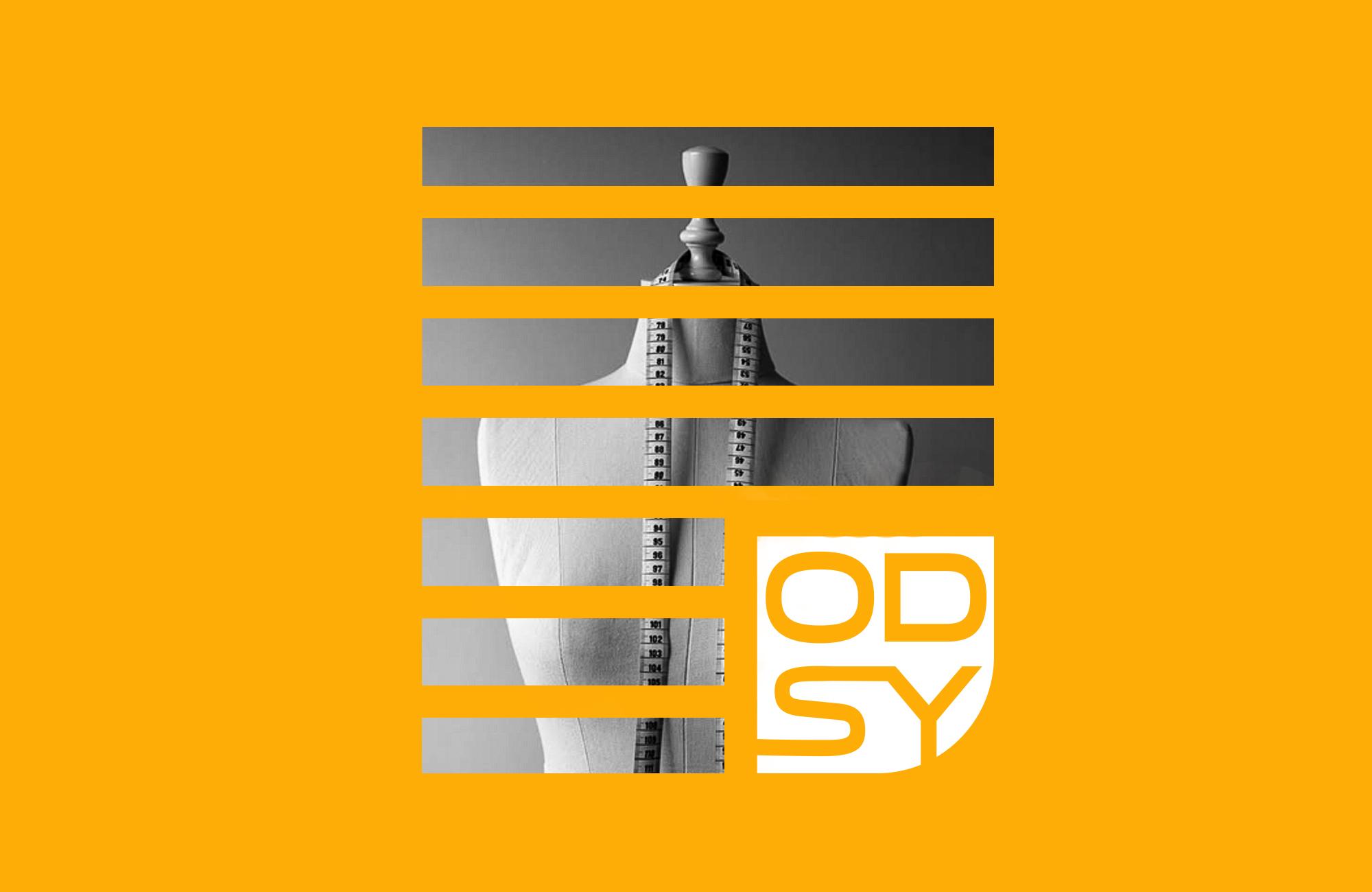
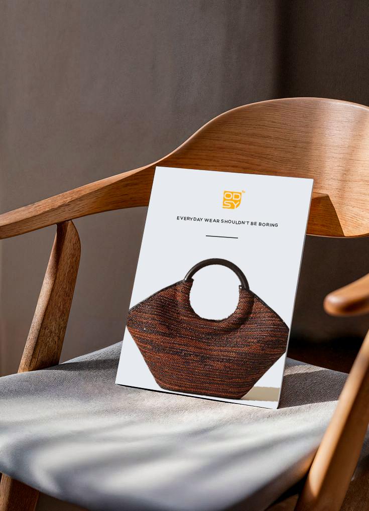
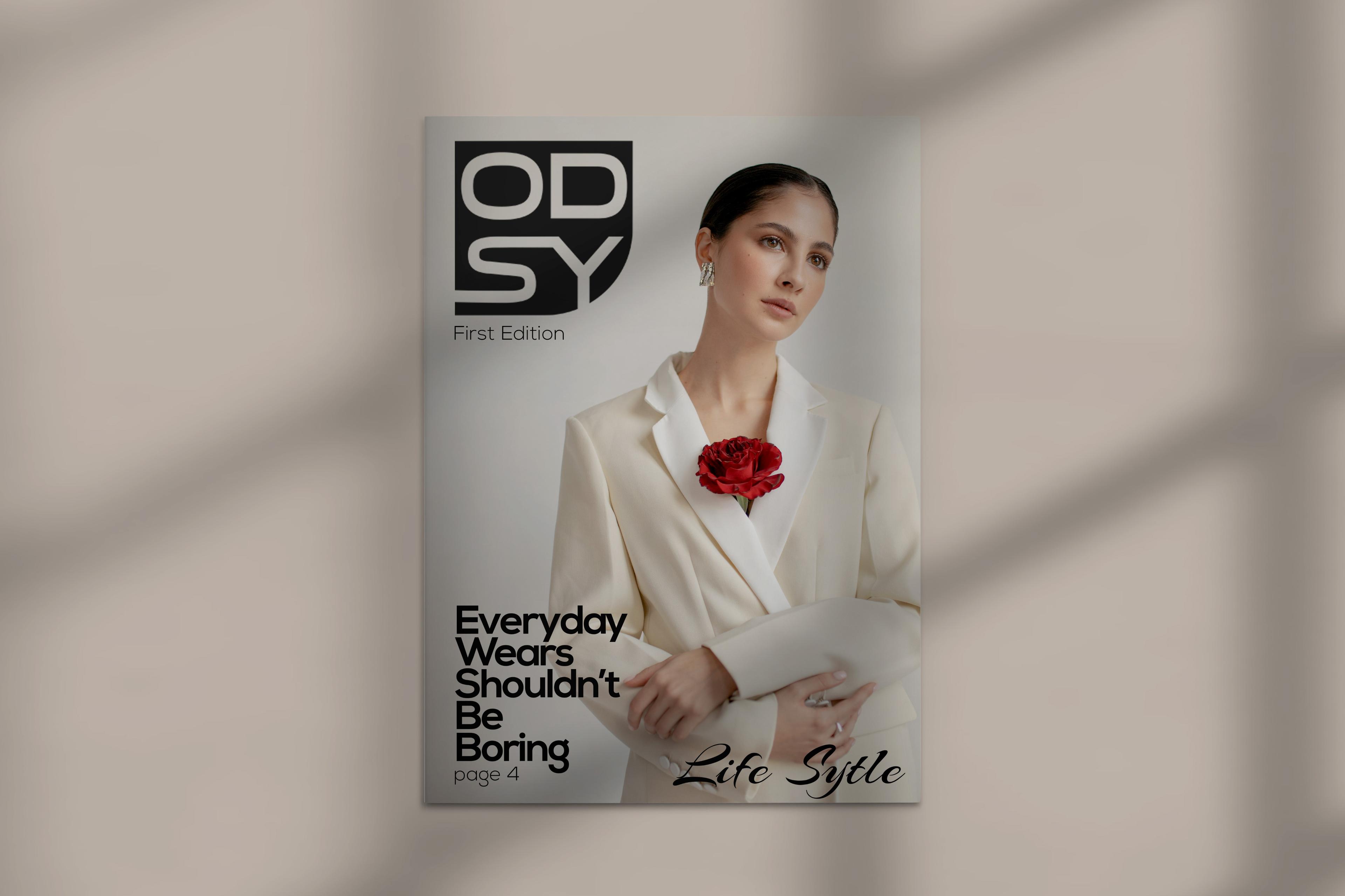
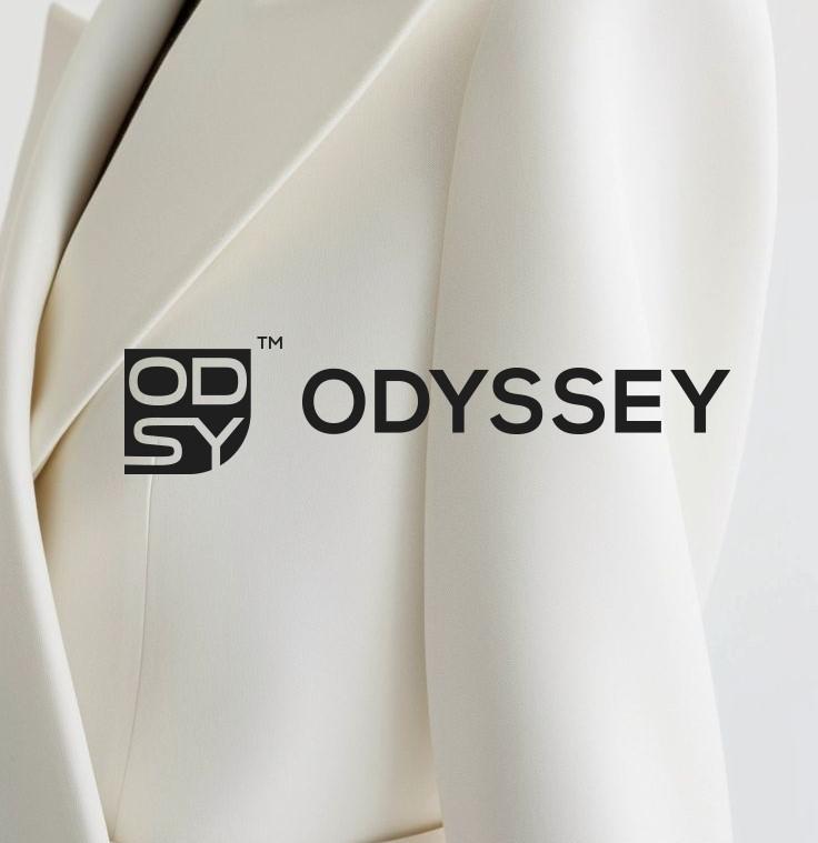
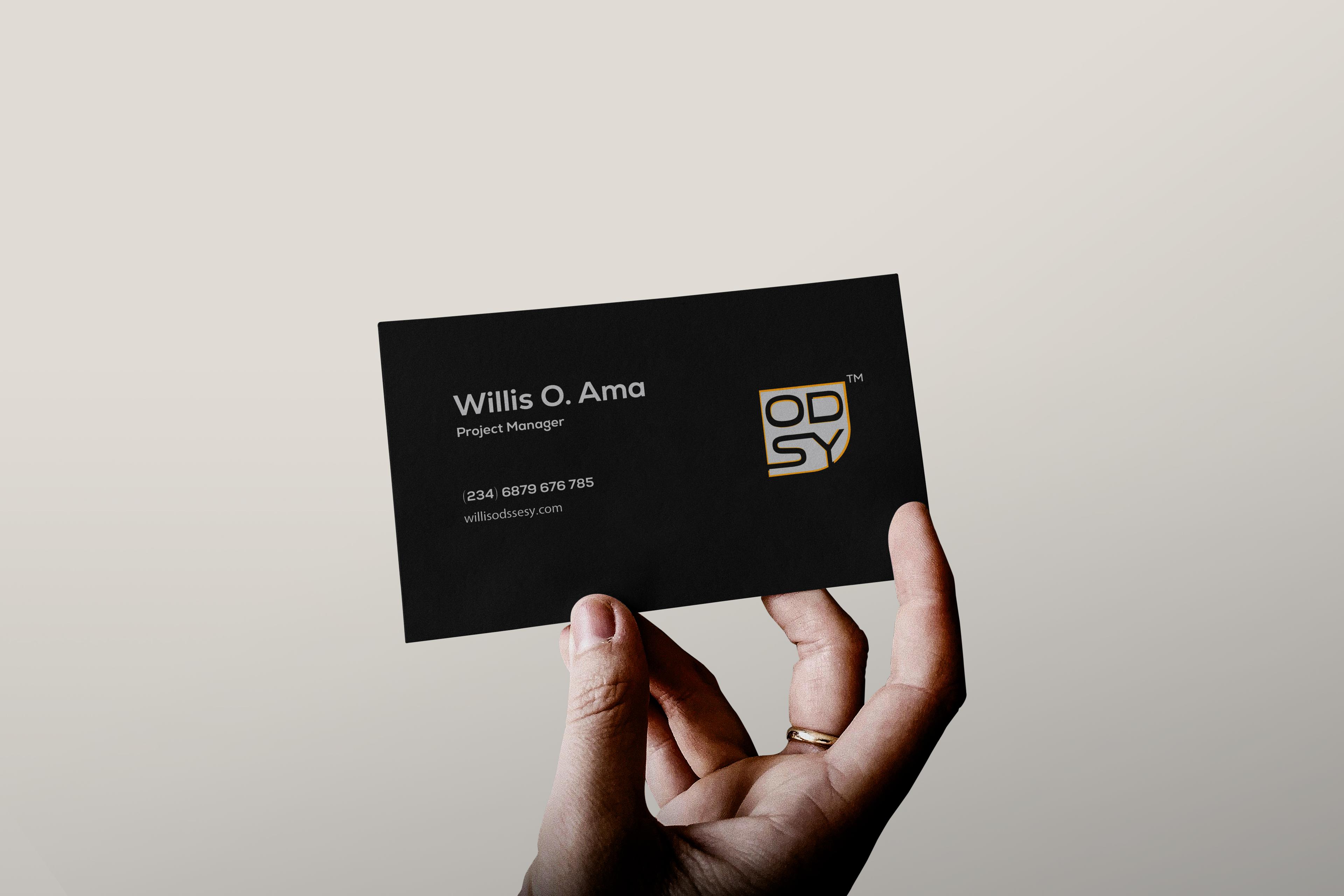
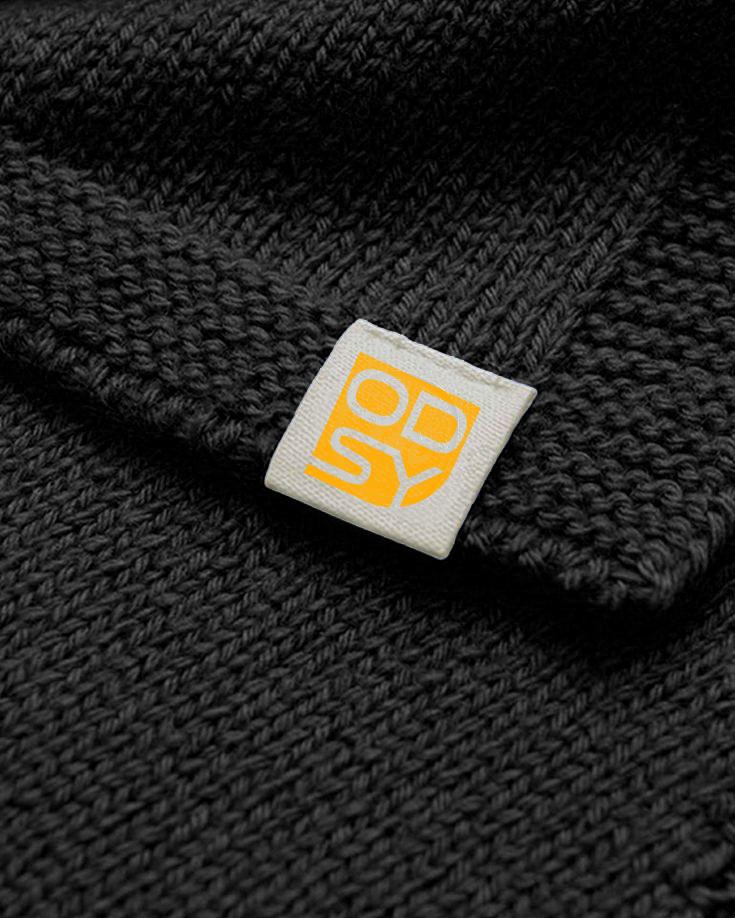
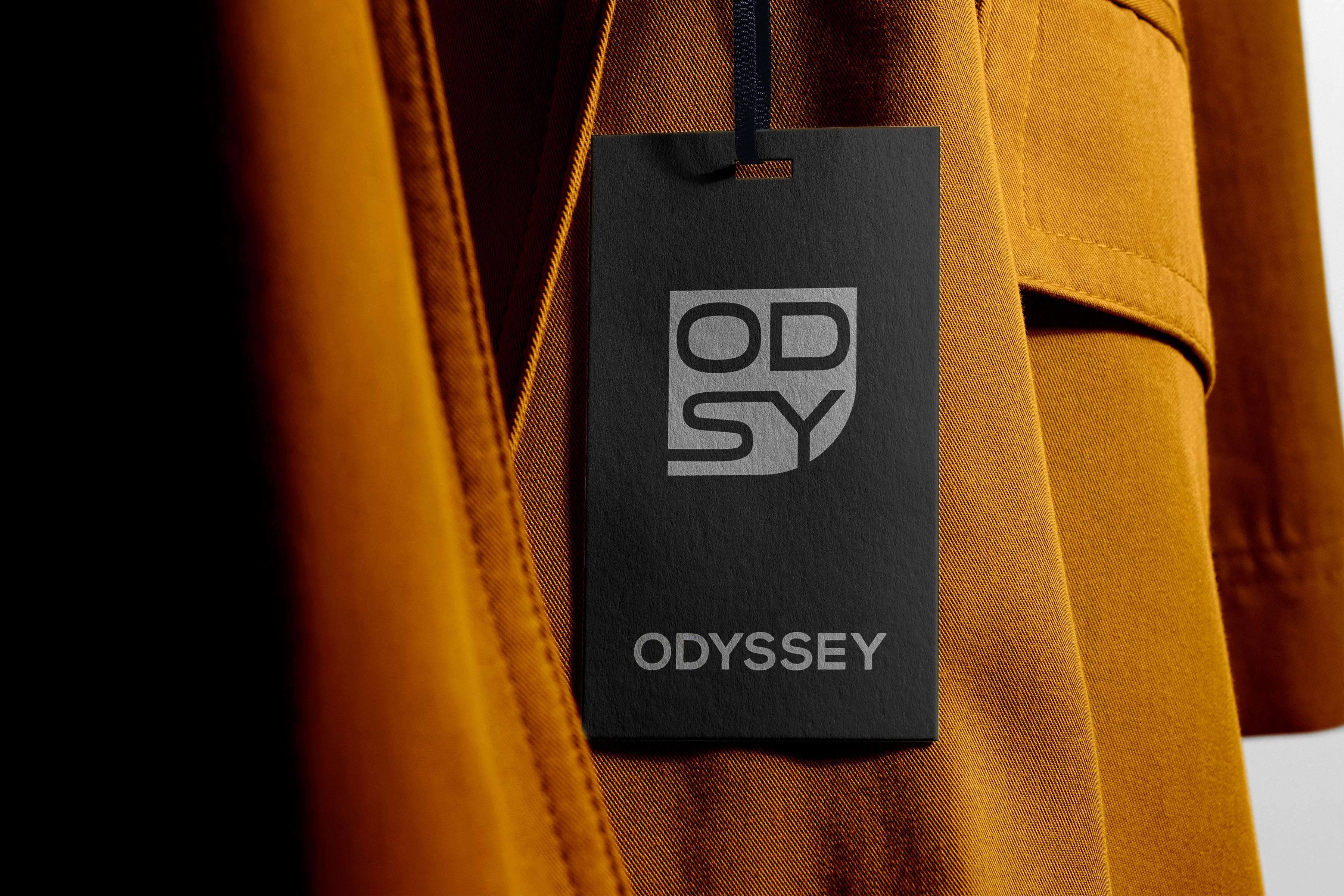
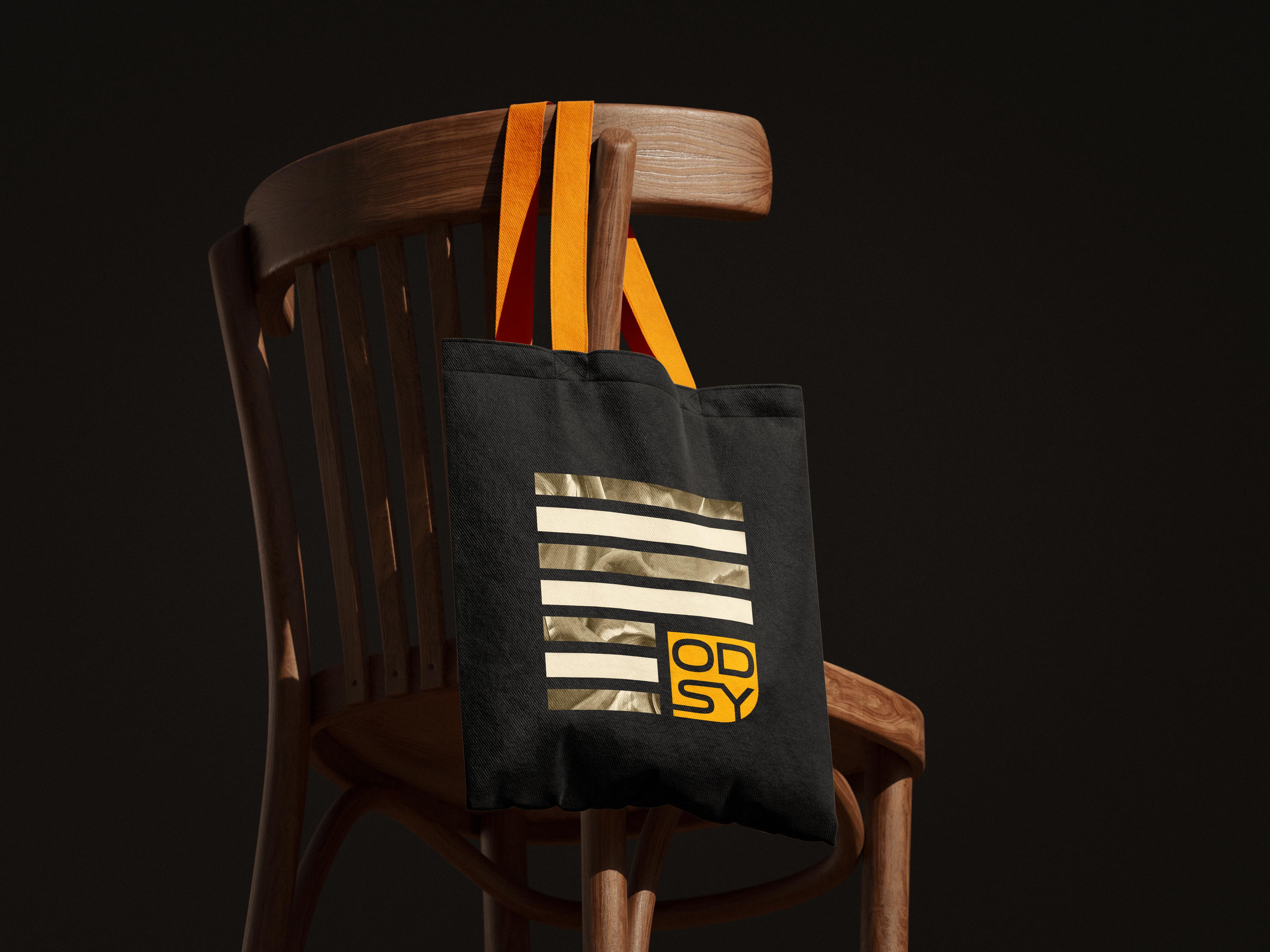
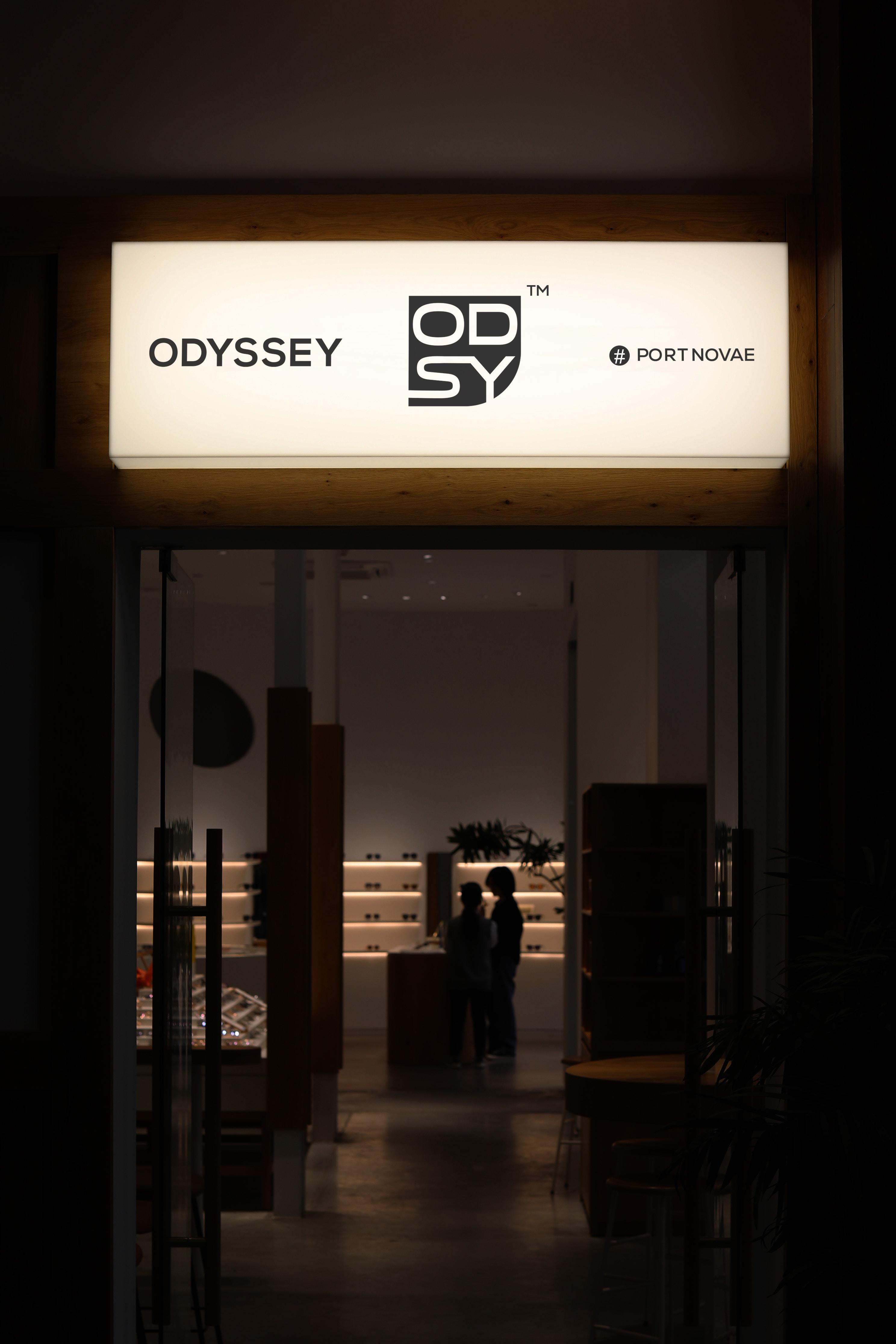
Duce Atelier built a combination mark: OD stacked over SY inside a rounded, asymmetric badge, paired with a full ODYSSEY wordmark. The monogram works alone at small sizes — tags, favicons, packaging — while the full lockup carries the name at scale. A third variant, a circular badge with the wordmark arced above and below the monogram, adds a stamp-style option for physical applications like hang tags.
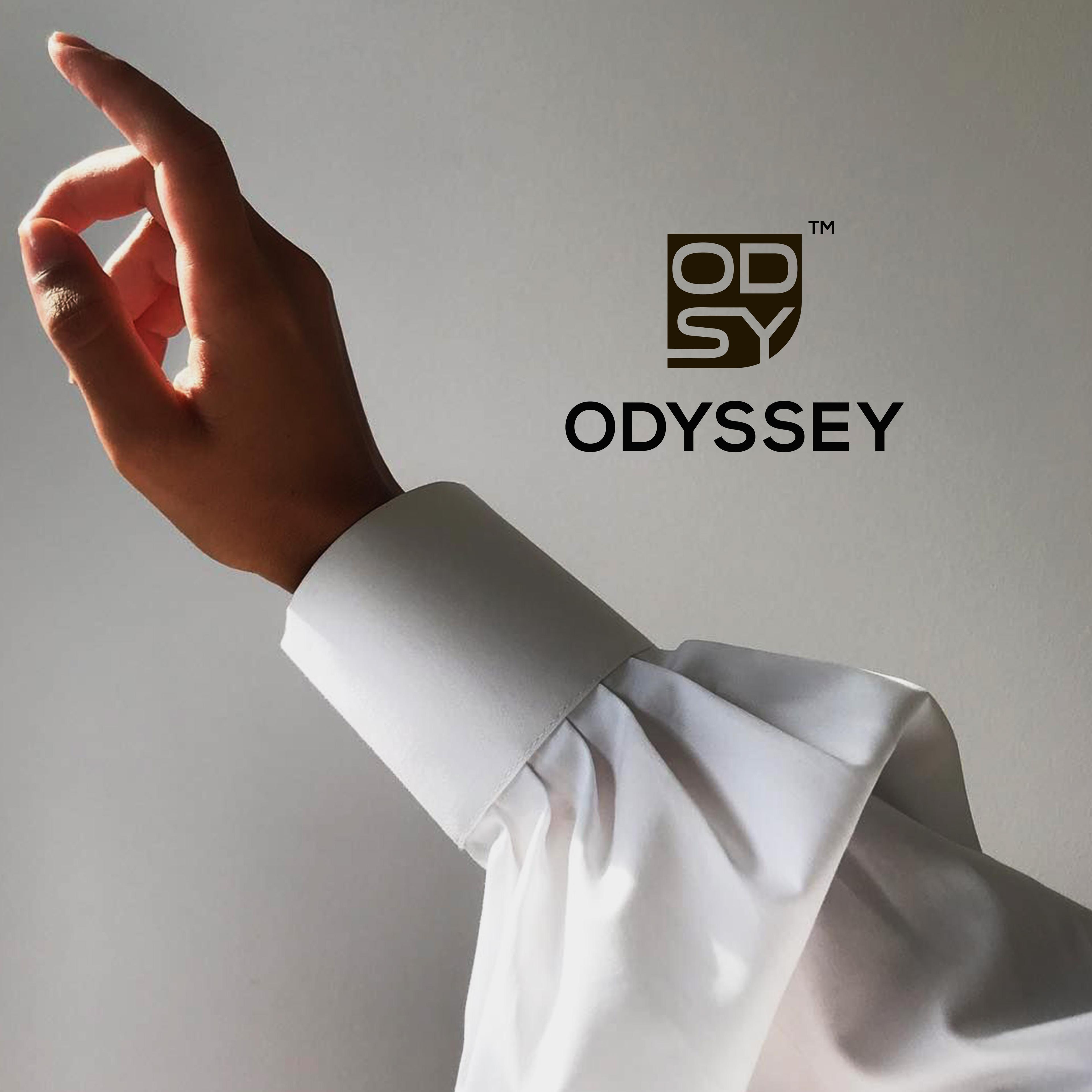
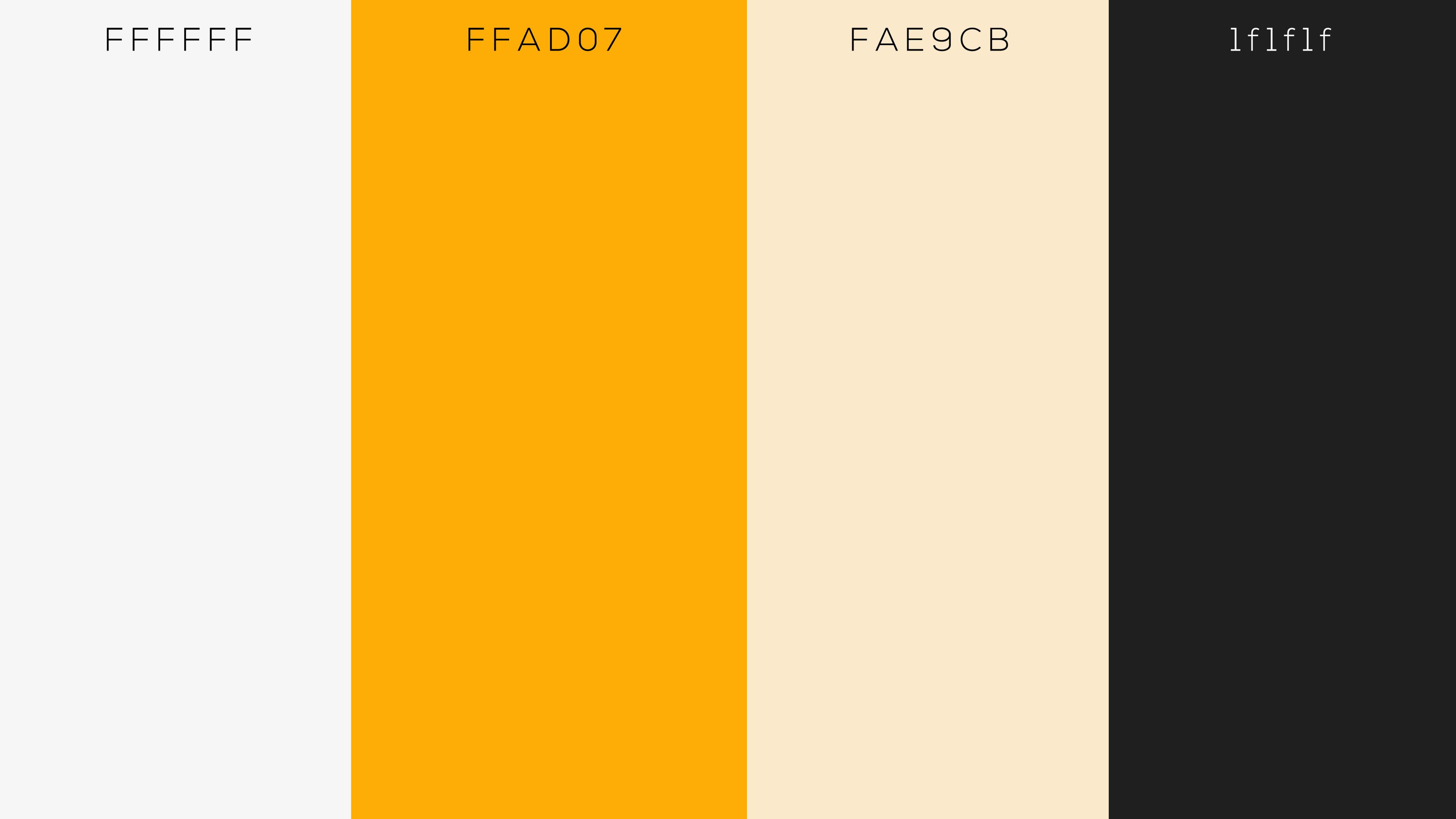
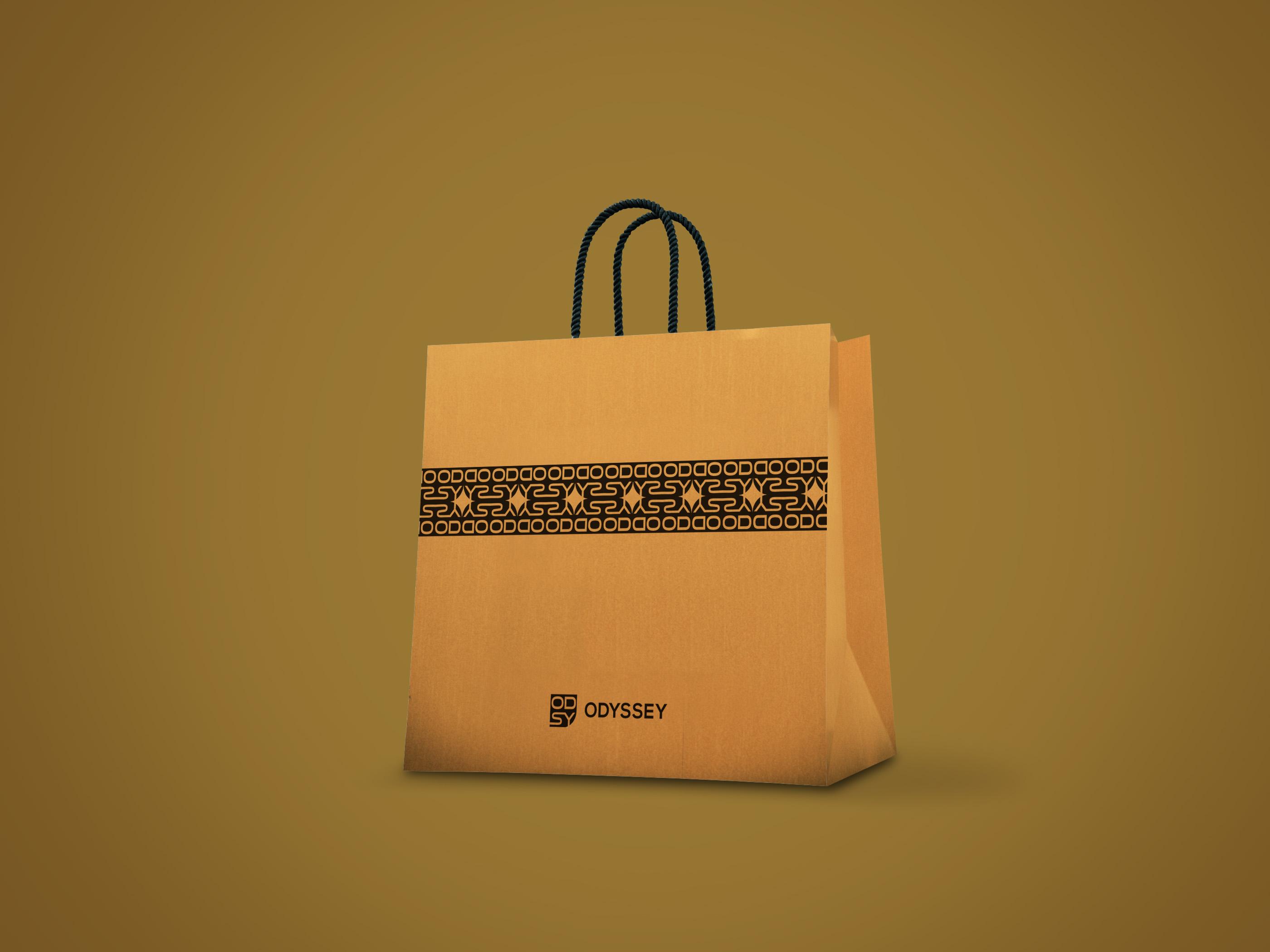
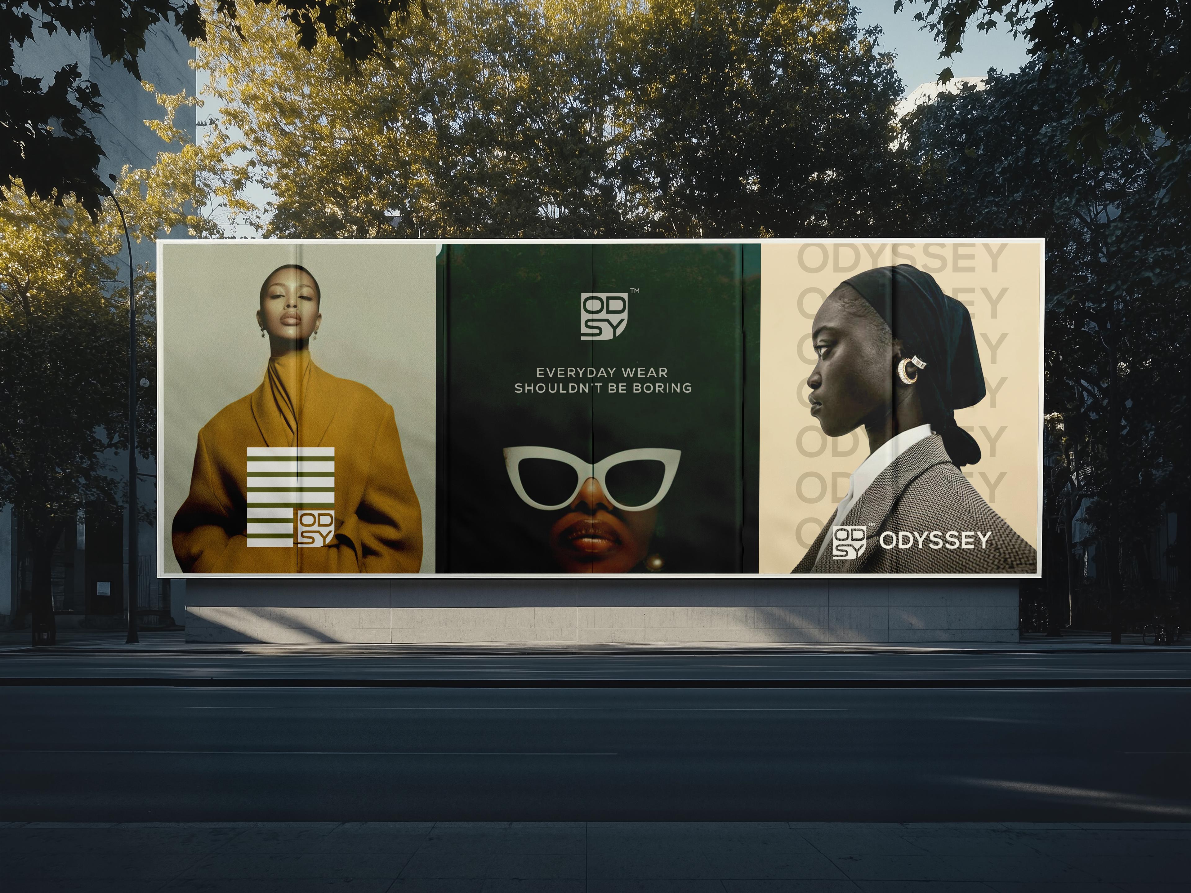
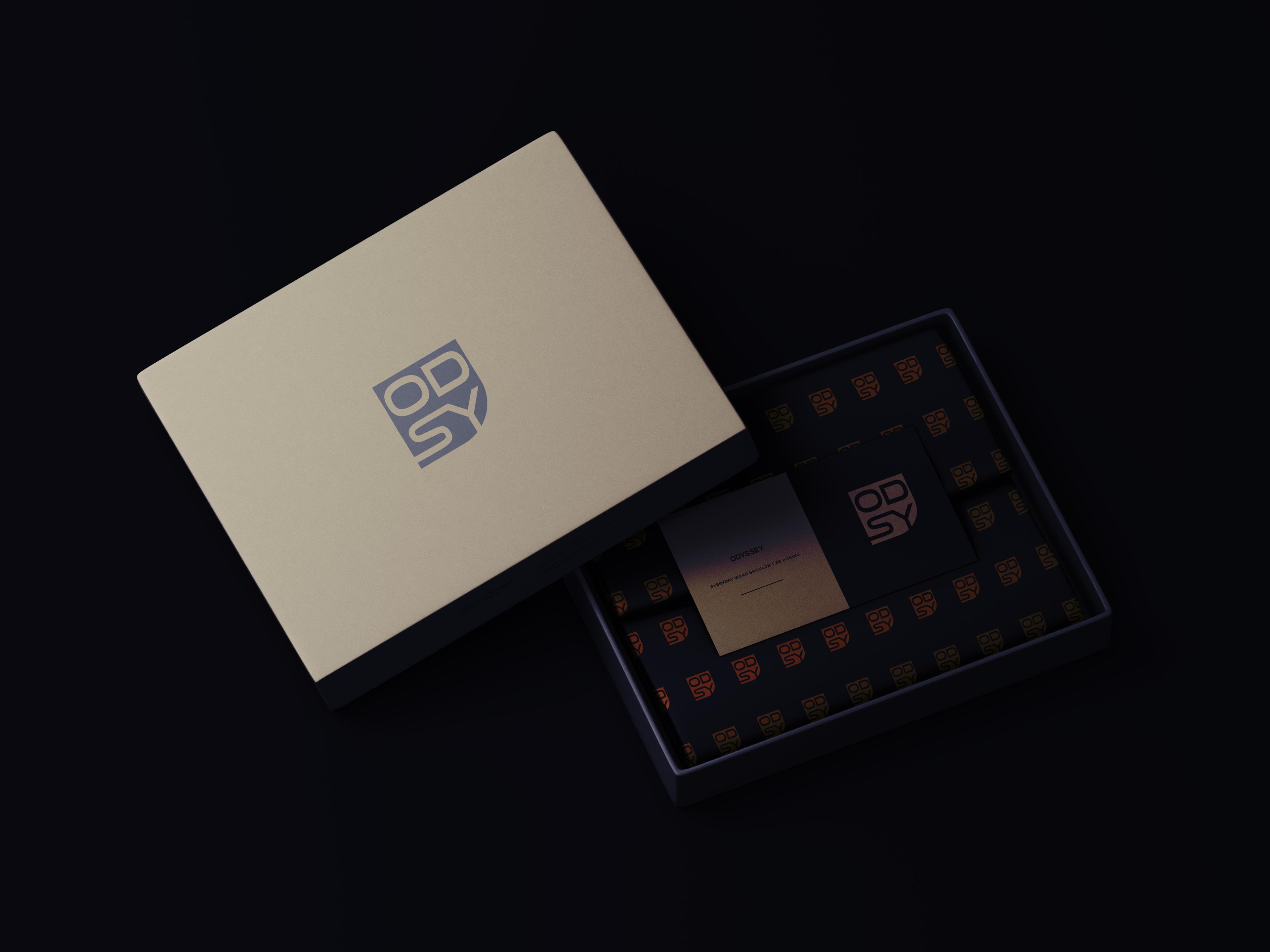
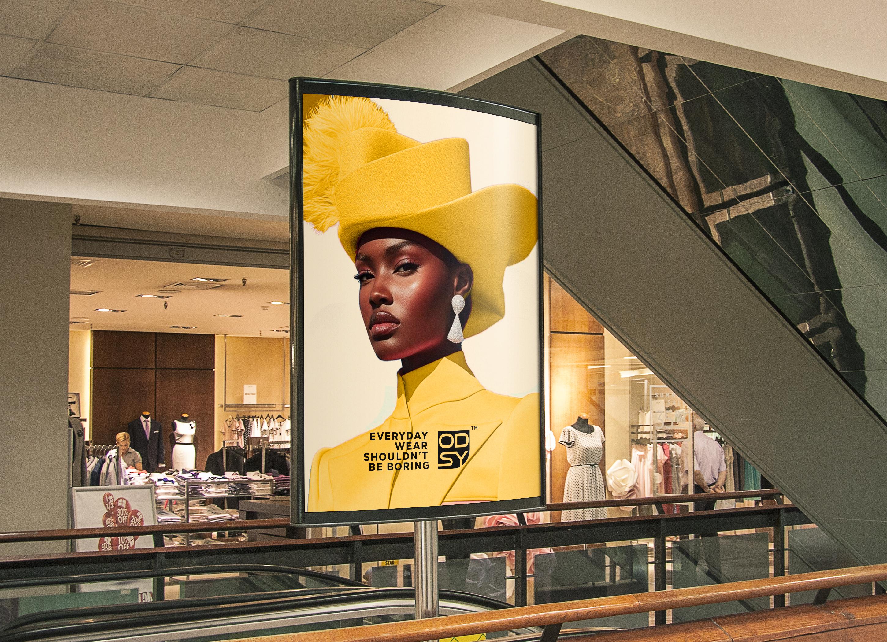
The palette is a warm amber (#FEAD06) against cream (#FAE9CB) and a near-black #1F1F1F — confirmed consistent across the primary lockup, the reversed panel, and the campaign material, which is worth checking for on every project, since color drift between the logo file and the marketing collateral is one of the fastest ways an identity starts looking unfinished. The system extends past a static mark into a repeating geometric pattern built from the same O/D/S/Y letterforms, giving the brand a print-ready texture. Tested across light, amber, cream, and dark-reversed backgrounds, the lockup holds up wherever it's placed.